User Interface Design Skills and Philosophy
A great user interface is a successful agreement with the user.
"As a user interface designer, I am the advocate for the end user. The business needs are important. The engineering considerations are important. But, at the end of the day, if the product doesn't deliver the right user experience, you don't have a product." -- Bill Benoit, Heynow Software User Interface Designer
"Sometimes flashy is not what is needed. Fitting the level of flash to the type of application is a skill. Not everyone has that skill. I have seen things with too many bells and whistles for what is needed, and it is just confusing." -- Louise Koutavas, Heynow Software Technical Writer
What's our design philosophy? We focus more on interpreting what customers want for user interfaces then to invent our own. We've honed our skills at making sure we get what the customer is looking for, coaxing it along at times, instead of inventing a user interface for them and selling them on it. Sure, we sometimes advise a customer not to do something and sometimes we do have to sell them on a UI element, even if for the purpose of challenging them to even come up with better. We pride ourselves in our ability to listen, and realizing a customer concept and style such that they are delighted with the results and working with the customer to discover their actual needs and their customers' needs ... and using our experience gained to assure that the result is usable and is both 'customized and standardized' at the same time.
Here's a small gallery of some work we've done for customers. While it doesn't fully cover the over two dozen commerical applications we've designed, implemented, and shipped to thousands of users in the last eleven years, we feel that these examples highlight some of our user interface design philosophy.
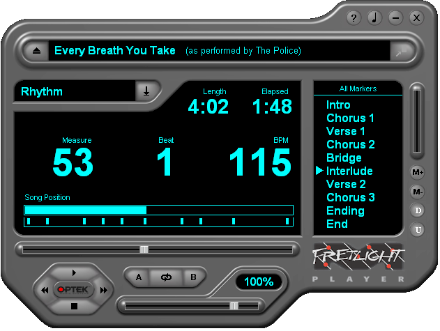 |
Fretlight M-Player is the first cool Mac OS X applications we did for the folks over at Optek for their Fretlight learning guitar.
The Mac M-Player application is a faithful reproduction of their existing Windows application. We completely rewrote the app in Cocoa/Objective C, getting their distinctive user interface exactly the way they laid it out for Windows. From start to finish, we implemented this application in a little under two months time. |
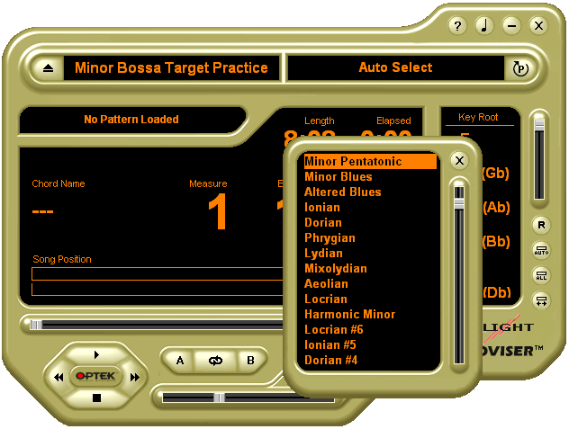 |
Fretlight Improviser is the second application we did for Optek. This application teaches you how to do chord progressions and improvisations on the Fretlight guitar.
Though this was another rewrite, we were able to use the work we did on M-Player and deliver this application to our customer in under a month. |
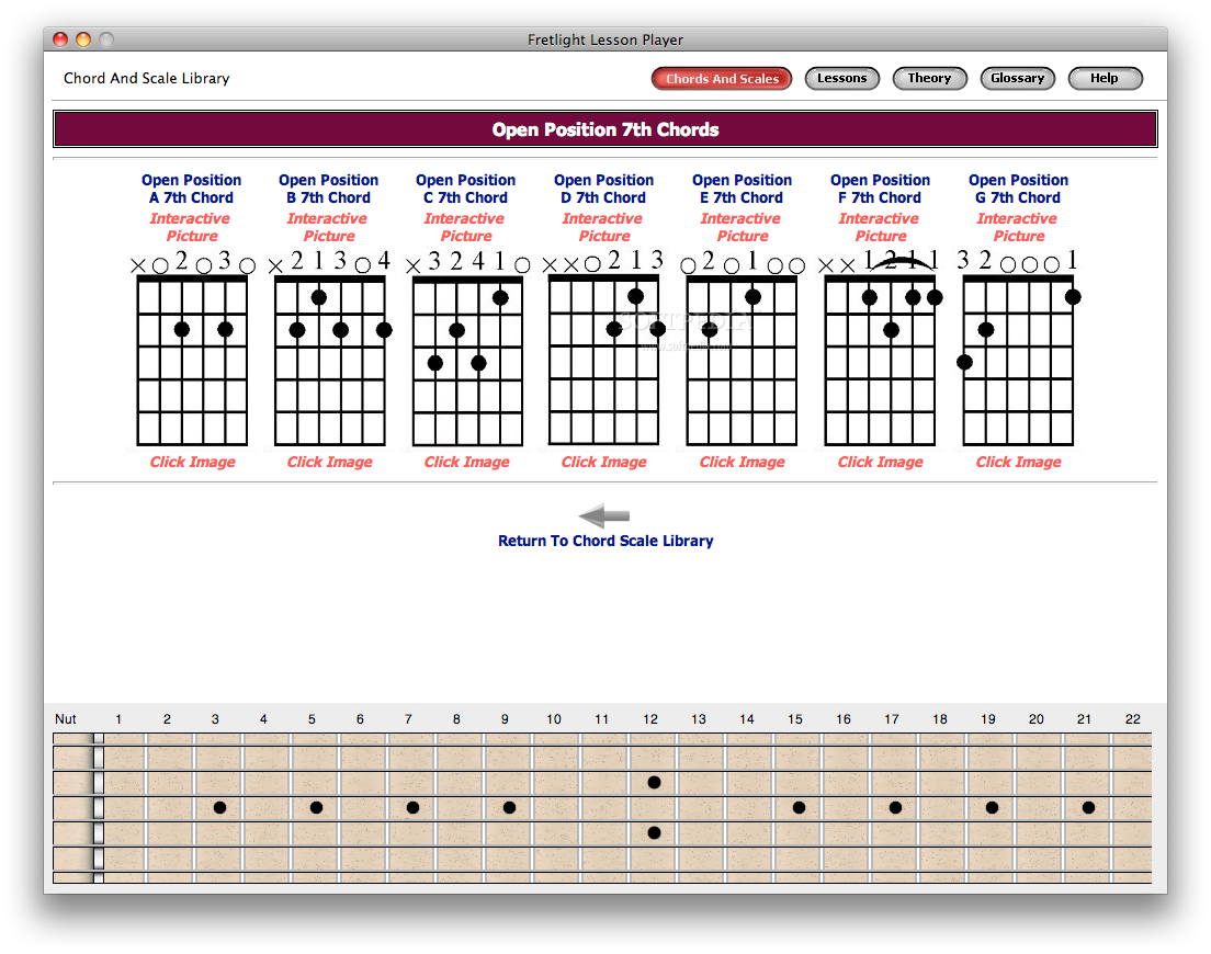 |
Lesson Player is the third application we did for Optek. This application allows you to view and use Optek's Lesson Paks. Each Lesson Pak contains anywhere from 10-20 lessons, all fully interactive with the Fretlight Guitar. Each Lesson contains interactive pictures, audio instructions, and play-along MIDI tracks taking you from knowing absolutely nothing about guitar, through strumming, using tablature, and scale playing.
Here again, we followed the user interface design of the existing Windows application faithfully, in this case, a hybrid of a web browser and a desktop application. Because we had the benefit of rewriting the application, as opposed to merely porting it, we were able to
streamline elements of the user interface and in some cases, remove clunky user options with some well thought-out default options. This resulted in a smoother more polished app on the Mac, while still maintaining a look and feel with the app's Windows-based cousin. |
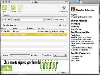 |
We implemented the Mac OS X Jambo client for our friends over at Jambo Networks.
We had free reign on this Mac OS X rewrite of their Windows based chat and proximity finding application. We took full advantage of Cocoa's marvelous set of frameworks for UI layout and got a number of compliments from the Mac user community on how well the application felt like a well honed Macintosh application. |
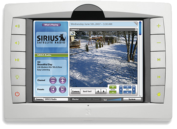 |
We designed and implemented a signficant portion of the user interface for Russound's Color Touchscreen TSV-E5. This wall-mounted touchscreen offers advanced features, such as a wake-to-music alarm and sleep timer, full control of a Russound SMS-3 Smart Media Server, including theme editing and IP based CCTV camera support.
We faced a number of design challenges on this application. We worked very closely with the customer to craft full functional and design specs to ensure the product's requirements were well defined and reflected into the product's user interface. This paid off with having not only a workable application for the user, but a well defined architecture for future developments. |
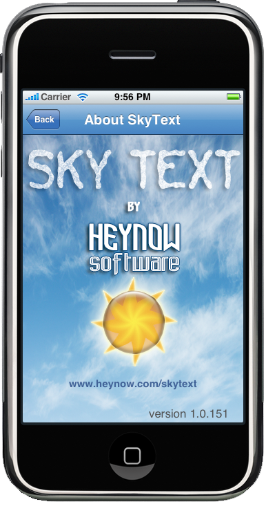 |
SkyText is an iPhone app that scrolls messages in large text across the iPhone's screen. It is a Heynow product and our first entry into the iPhone App Store.
Though not necessarily a "flashy" iPhone application, it is thoroughly designed to work "the way you would expect it to", with a high adherence to Apple's Human Interface Guidelines (the "HIG"). Watch the SkyText Tutorial and you'll see the attention to detail that went into this seemingly simple app. |
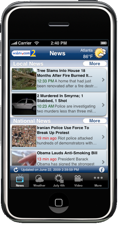 |
Local News is an iPhone application that aggregates content from over 168 TV news stations. Developed for our customer Local Solutions Network. It's been a top ten news application in the App Store since it was released in summer 2009.
Local News is currently the most ambitious iPhone application we've taken on. It is big, covering almost every aspect of the phone: video playback, networking, Touch gestures of all kinds, and plenty of customized graphics. We designed the look and feel up front with them using a wireframing process and then added per-station customization options. These customizations are controlled by the server. |
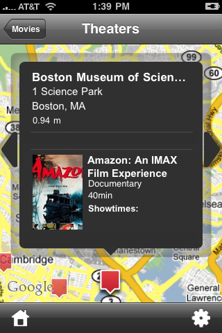 |
WHERE® is an iPhone application we helped develop for our friends over at uLocate. WHERE allows you to quickly launch a mobile experience that puts the people, places and things you look for at your fingertips while on the go.
James did the mapping user interface impmentation fo mapping along with various other components of the app. |
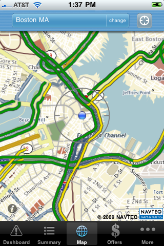 |
Traffic® is another iPhone application we helped develop for uLocate. Traffic keeps you posted on real-time gridlock, accidents, weather delays, and road construction.
James again did the mapping user interface implementation here too. We got mapping user interface design and implementation down cold. |
 |
We implemented a major portion of the user interface for Avid's Interplay Assist, a newsroom transcription logging and story editing application.
We had the opportunity to implement this BIG application from scratch, with the idea it would be deployable on multiple platforms, potentially. We did the development using Trolltech's Qt framework and provided the majority of the view architecture and middleware for the application. This application, as mentioned, was BIG, we wrote over 100,000 lines of code on this project in under a year's time. |
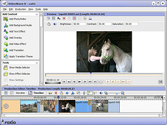 |
Avid Cinema's primary means of distribution was the Apple Macintosh Performa 6400 bundle, which included an internal PCI capture card and the Avid Cinema software pre-configured at the factory.
Jay did parts of the user interface for the application. Working closely with both Apple and Avid, Jay's bullet proof UI design and implementation led to a bug free app that landed on the desktop of thousands of Performa 6400 owners. This was commercial software engineering at its finest. No holds barred quality and usability. |
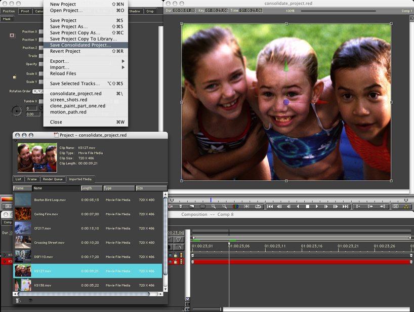 |
We played an important role in delivering user interface work for both version 2.0 and 2.1 of the Boris RED for Artel Software. Boris RED is a 3D compositing tool for creating special effects for digital video.
Jay and his team designed and implemented major pieces of the user interface of this popular professional editor's application. For example, he designed the Object Library browsing tools. |
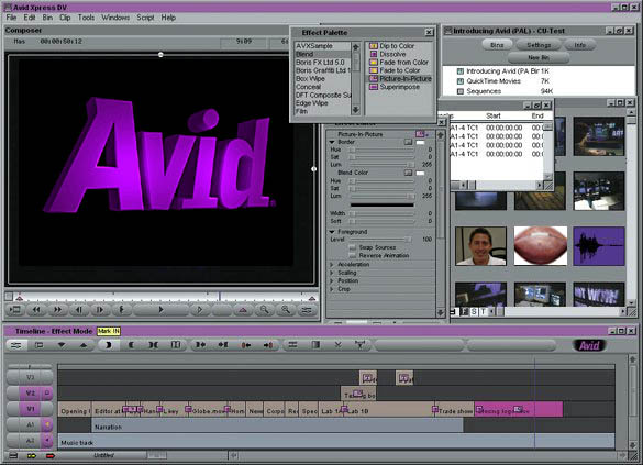 |
Jay developed various user interfaces components for Avid's Media Composer, the Macintosh application that originally defined non-linear film editing for Hollywood.
"I took pride in doing elements of Media Composer -- designed and implemented over 15 years ago, these user interface elements have been used by countless professional film and video editors right up to the present time. They become invisible to the user -- tools and concepts that work so smoothly you don't see them anymore. That's a hallmark of a great set of to
ols that get used hundreds of times a day." |
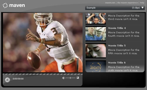 |
Jay developed Windows and Mac OS X download client applications for Maven Networks. This application has been deployed by Premiere Radio for the "Phil Hendrie Show" and for other radio talk shows as a means for paid subscribers to automatically receive the radio show as .mp3 files.
Jay developed these apps in parallel on both Windows and Macintosh and did the user interface design and all the implementation. Each app had a native look and feel to its desktop and shared a fair amount of common code. A very successful application for the customer. It was simple to use and bug free. |
"I realize I have, at times, operated as a 'cover artist' -- replicating other ideas and themes because that's what the customer needed. It's like being willing to paint a velvet Elvis because more people get that instead of doing abstract cubist post-modern blobs of paint to make a statement with. Isn't that what good user interface is about? Not making the user have to THINK when interacting with the software? But, instead putting up controls, buttons, links, etc. that the user can and will recognize and just know how to use it. That's what I look for in one. 'Just get out of the way, UI, and let me interact with my content!'" -- Jay Koutavas, Heynow Software CEO and Lead Engineer
"[...the design philosophy] is about ease of use, with tasteful and current-style visual elements backing it up. Putting the customer's customer first. It's like... a company has to put their customer first if they want to succeed. As a designer and engineer working for companies to create products for their customers, you need to think of not just pleasing your direct customer (the company) but also their customers. Thus... putting the customer's customer first. In loco companus... or whatever "company" is in latin! :-) You are acting in the best interest of the company that hires you, with respect to their customers. This includes: ease of use, functionality, trouble-free operation (aka delivering bugless products; fast response to any bug; appropriate testing), maintainability." -- Louise Koutavas, Heynow Software Technical Writer
|